


Colour
16 grey living room ideas that will inspire you to decorate with this timeless hue
Joy Archer

Thinking of updating your living room? Whether you prefer paler pastels or beautiful bolds, here’s how to pair two different colours to striking effect.
If you still live by the adage that blue and green should never be seen together, then you may struggle when it comes to choosing the right colour combinations in your home.
In fact, throw interior trends that seem to change every month into the mix, and deciding on your decor can sometimes feel overwhelming.
So, we’re here to solve your decorating dilemmas. We’ve delved deep into the wonderful world of colour to share a range of two-colour combinations that will leave your colour queries abated, and your living room top-rated.
 Credit: Snug Sofa
Take inspiration from autumn colours

Green, in all its glory, is often seen in interiors for good reason.
“Psychologically, we associate it with life, contentment, security, and love,” says Emily Simmons, creative director at rug company Ruggable.
“It creates a sense of balance and tolerance in people and can create an optimal feeling of wellbeing in your interiors.”
And as the living room is a place we use for socialising, shelter, recharging and recuperation, it’s the perfect location for shades of green to wield their nurturing powers.
When it comes to choosing a colour to combine with green, take inspiration from nature’s autumnal show and add orange.
“Orange and green can clash if used incorrectly. However, they do form a bold contrast when placed beside one another,” says Francesca Hadland, styling expert at furniture company, Bridgman.
In this design, a light sage green is complemented by a darker burnt orange. It works well as there is one brighter colour combined with a more muted tone, which balances out the overall look.
If you prefer a brighter green, follow the same principle by pairing a lighter peach shade with emerald green.

Combine purple and yellow for a regal style scheme

Prefer your living room to pack a punch? Be bold with tones of purple and yellow for a scheme that exudes warmth, elegance and a sense of spirit.
It’s also a duo that nods to a more regal feel. Purple and gold have long been associated with royalty and it’s likely why this scheme has opted for a shade of yellow that’s more golden, than egg-yolk.
Although Simmons also says there’s a reason why we often find ourselves drawn towards this colour choice in more social spaces.
“Yellow is the brightest shade on the visible spectrum, representing light and positivity,” she explains. “Opting for yellow walls can give a room a feeling of warmth and hope. In addition, yellow symbolises a sharp mind, intellect, and curiosity.”
Unless you’re opting for a living room scheme that says dopamine décor, chose a darker shade of plum and complement golden-yellow walls with brushed-gold accessories and crafted wooden furniture.

Black contrasts beautifully with terracotta walls

“Black and orange create a striking contrast in the living room,” says Jonathan Clark, creative director for furniture brand Shelved. “Bold and invigorating, orange adds warmth and personality to the room while darker tones will help to ground the space, adding a touch of modern sophistication.
“An ideal pairing, the two colours balance each other out perfectly to create an inviting yet cosy living space.”
If you find yourself inspired by this idea, follow the rules of this scheme and use an almost terracotta shade of orange for your walls, a deep, dark black but then soften with some lighter shades of orange in furniture, rugs and accessories.
As the darker colours will also absorb any natural light, you may want to keep your ceiling white so that it will reflect the light into the room. To avoid too harsh a contrast, choose an off-white to help retain an element of warmth.

Pick pink, patterns and shades of green

“Green and pink is a colour combination often seen in the natural world,” explains Shelley Cochrane, accessories buyer at Furniture Village. “These shades also work beautifully within interior schemes.
“A soothing combination, green works well as the main colour of the room across larger pieces of furniture such as sofas. Introducing an accent pink through the addition of cushions and accessories helps to revitalise the space. Don’t be afraid to add pink to the walls too,” she says.
“This can elevate the look, and make it feel more classic and timeless.”
And if you lean towards a more maximalist approach, add patterned cushions and rugs, and an unexpected pop of navy blue on a piece of decor such as a lamp. It’s an extra-stylish statement in an already sumptuous space.
It’s also important to remember that a two-colour combination doesn’t have to mean using the same shade or tone of each main colour throughout the scheme. Adding different tones for each one will create a richness and depth to your living room and avoid it feeling too basic.

Captivate your senses with bright blue and orange

If you’re looking to create a fun and colourful living room, pick bright cerulean blue and energising orange.
According to Simmons: “Blue is generally considered a calming colour,” making it ideal for a living room where we often look to unwind at the end of the day.
However, it also “inspires us to focus on the now”, to be here in the present moment, which is perhaps why it pairs so well with the immediate energy-boost of orange. It’s a scheme that’s both grounding and inspiring in one.
We also love how the Mediterranean vibes of this scheme are used to good effect. Although this bright combination could have been used to create a summery scheme, by using blue for the bespoke library shelving it makes the scheme playful rather than pastiche.
Looking for more ways to use blue in your interiors? Read our blue bedroom ideas.
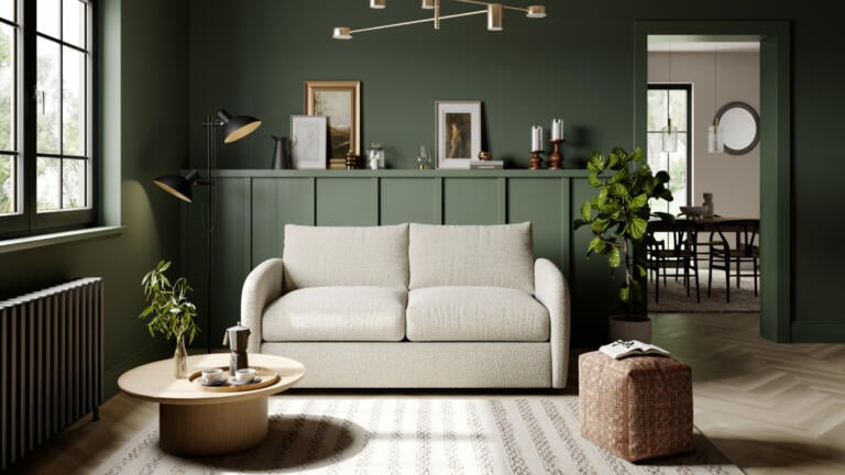
Cocoon yourself in a cream and green haven
“A dreamy colour combination, green and cream will add a calm and tranquil feel to any living room,” says Dani Burroughs, head of product for furniture company Snug.
“Bringing a refreshing hint of the outdoors in, green is ideal for creating a personal oasis and pairs perfectly with timeless cream hues and off-whites. The result? A living space that screams pure relaxation.”
We love how this scheme has adopted the to create a living room that feels almost embedded within the earth. And although the small amount of natural light could make the green feel overpowering, by adding a cream sofa, light wooden flooring and a rug in similar shades, natural light is reflected back into the room.
Layers of lighting also bring light to key areas, with a carefully positioned floor lamp and living room ceiling lighting directed over the main seating area.
When it comes to colour drenching, a popular interior design technique, Emma Bestley, creative director and co-founder of paint brand YesColours shares her tips.
“For maximum impact, opt for full drench, meaning the same colour continued from the wall up to the ceiling. Pick out a complementary colour, whether that’s a much paler version or an accent colour, to add contrast. If you have a small space, consider a muted, calm colour like a warm neutral, pale pink or sage green. If you’re hoping to achieve a cocooning and cosy feeling, don’t be afraid to use darker hues. That added depth can be really inviting in a space, especially in a living room.”

Pink and white stripes can still be grown-up

Less and more pretty pastels, the combination of pale pink and white in a living room is a great way to do decorate with pink, without seeming too sugary sweet.
The stripes on the sofa fabric also help add a touch of classical design to your living-room scheme. It’s a technique that works particularly well when the stripe is either muted or bold, according to Sue Jones, founder of Oka.
Her top tips for decorating with stripes? “You should avoid introducing stripes with too many colours, which can clash and make the aesthetic appear chaotic. Instead, limit yourself to no more than three colours of stripes; a main colour, and two supporting colours, or alternatively a classic two tone, which will never go out of fashion.”


Red needn’t be dangerous when combined with cream

Although red is a colour loaded with connotations, from love right through to danger, it’s also known for its mood-boosting qualities. As a result, it’s best used in rooms where energy serves to enhance, rather than hinder the overall feel. Although some may consider red romantic, it may not be
“Deep reds and burgundies will create a warm, cocooning feel when paired with cream and pale wood tones,” says Natalie Mudd, creative director at The Wood Flooring Co.
“Ideal for large, open-plan spaces, the contrast of this autumnal pairing creates a cosy and intimate space. The creams emphasise the warm undertones and rich red hues; perfect for living rooms and snugs.”
We love how this scheme also adds a stripe of darker red around the bottom of the walls, grounding the scheme firmly in place. The darker tone is then picked up in soft furnishings and accessories, beautifully tying the scheme together in one cohesive look.


Combine navy with white for a timeless design

For a classically striking two-colour-combination living room, it’s hard to go wrong with navy and white. Incredibly chic and suited to any type of interior, it’s a scheme that’s timeless, ageless, and always in style.
If you prefer a slightly warmer feel, pair with brass or gold light fittings. Layer sofas with patterned throws and textural cushions, add in wicker and wood accessories and you’ve got a scheme that feels cosy but still contemporary.
We love how this scheme has taken the braver option of painting the walls in dark navy rather than sticking with the safer choice of white. Adding a picture-rail trim in white also helps draw the eye upwards, thus preventing the walls from feeling too overpowering.

Create a show-stopping space with a monochromatic colour palette

When it comes to a black-and-white living room, it’s easy to assume you must fall into one of two camps – modern and minimalist or gothic and dark.
While a monochromatic approach makes it easy to achieve either style, there’s also a middle ground, where light and dark can combine to highlight the fixtures and fittings within your room.
Line your walls with a darker, more textural wallpaper and paint woodwork in matt black to create a stunning backdrop against which to showcase graphically inspired artwork and striking ceiling chandeliers.
To add an element of warmth, bring out the bouclé for a cosier furniture feel and use brushed gold metal finishes for side tables and décor. If you must add colour, do so only with dark leafy greenery.

Written by Sarah Harley she/her
Published: Updated:
Since first picking up a paintbrush and experiencing the joy of re-decorating her bedroom in a questionable red, white and grey scheme as a young teenager, Sarah Harley was hooked on the world of interior design. This obsession even led to a real life ‘Grand Designs’ project in 2005 when she donned a pink hard hat and appeared on TV screens, project managing the renovation and extension of a Grade II listed 17th century Folly in South Wales.
Throughout her career, Sarah has gained an array of experience in several different roles, ranging from copywriting, PR, events management and photography to interior design and home staging. With her two passions being the written word and the joys of a beautifully designed home, Sarah’s mission is to open the door on the world of interiors, inviting readers in to help them work their way through the vast choice of products, ideas and trends so that their own homes can reach their full potential.
Joy Archer

Joy Archer

Amy Hunt

Joy Archer