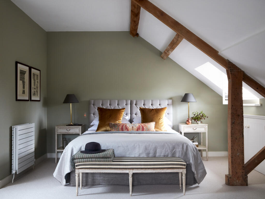
The best bedroom colours for a good night’s sleep
Joy Archer
Bold and bright, red can often be seen as a risky colour choice. But get it right and you’ll create an interior that’s resolutely resplendent.
Think of red and there’s a fair chance you’ll run through a list of items in your mind. From tomatoes to strawberries, Dorothy’s red glittery shoes to traditional British telephone boxes, and even the emotions of love and danger, it’s a colour that evokes like no other.
And while we naturally warm to it at certain times of the year (dare I mention the jolly man in the big red suit?), it’s not often a colour we immediately associate with interiors. Get it wrong and you risk creating a migraine-inducing interior that you end up avoiding at all costs.
But interiors experts are predicting it’s about to have a moment in the spotlight. So here’s how to decorate with red.
 Credit: Snug Sofa
It’s perhaps no surprise that vibrant colours will continue to reign victorious as we move into 2024. We only have to think of Viva Magenta, Pantone’s colour of the year 2023 and the rise of dopamine décor to know that in these post-pandemic times we’ve become more open to the power of bright and bold colours.
Debbie Leigh, design manager at fabrics company Iliv, agrees with the fact that red is on the rise, noting how “there has been a noticeable increase in the popularity of red with customers – many are drawn to its ability to create a striking focal point or infuse a space with vibrancy.”
 Credit: Iliv
But when there’s a whole rainbow of colours to choose from, why has red risen to be a front runner?
Tash Bradley, director of interior design and colour psychologist at paint brand Lick, says it’s our physical reaction to red that makes it work well in interiors. “In colour psychology, red is incredibly stimulating and triggers a powerful physical response in the body. It symbolises excitement, courage, strength, energy and warmth. When red is used in the right proportions, it really commands attention and makes an impact.”
In general, experts also believe it’s down to the fact that interior design trends are usually hot on the heels of the catwalk.
“Where fashion leads, interiors often quickly follow and, with the Barbie pink trend now at saturation point, it is scarlet that is the hue on everyone’s lips,” says Lucy Mather, interiors expert at furniture company Arighi Bianchi.
But with red so visually striking, how do we avoid creating a look that’s too overpowering?
“In the main, we’re seeing red being applied using home accessories,” says Mather. “The designer Jonathan Adler has lots of it in his range. Adding colour-popping home accessories that introduce the red interiors trend is a safe way to give it a go.
“And if we’ve learnt anything about interiors in 2023 then it’s that we enjoy having fun with our colour choices – expressing our personality and not taking ourselves too seriously,” she adds. “Red is a joyful and playful colour that you can really have fun with.”
 Credit: Beach House Art
Daniel Prendergast, design director at The Rug Seller says: “The best way to embrace this trend is to use it as a focal point for a pop of colour using accessories such as cushions, lampshades and artwork. If you want a more subtle look, then choose a patterned or abstract design which will break up the block of colour even more.”
He also notes how more natural shades of red “marry into our current obsession with natural and biophilic inspired influences,” making them ideal for floral designs. He suggests adding a floral themed rug to your living room as a great way of adding red in an understated manner.
 Credit: The Rug Seller
As well as giving even more depth to the warmer tones of wood in this scheme, it provides a touch of heat to the cooler tones of blue and green. Get the tone right and it easily works in a more classic interior.
Bradley adds: “As we never see colour in isolation, when red is used as an accent colour against softer tones, it really stands out. Red has the longest wavelength of all the colours, meaning that it advances towards you, and you’ll be drawn to it the most.”
 Credit: Lick
The launch of Lick’s new limited edition red paint, Red HTK 57, based on Heinz tomato sauce, is perhaps a good indication of how using red in your interior is less about picking a ‘fashionable shade’ and more about picking the right one for you.
Describing how it’s been made from a unique mix of pigments, blended to perfectly replicate the saucy red we all know and love, Bradley says HTK 57 is “an inviting colour for all of the senses, which triggers our appetites as well as our desire to chat.” She adds that makes it “perfect for social spaces in kitchens and dining rooms. Yellow undertones add a dose of fun and optimism, while black pigment tones down its intensity.”
 Credit: Lick
While some may favour this bolder pop of red, other experts are taking inspiration from the recent Barbiecore trend. “One of my favourites is cranberry,” says Prendergast.
“Cranberry is an uplifting and feel-good shade. It’s strong, optimistic and cosy. It is less harsh than a vibrant scarlet red, yet a step away from the pink hues that have been trending in recent months,” he adds. “It also pairs perfectly with lots of different neutrals, making it a more versatile shade than you might think.”
According to Mather, we are also set to see an influx of deeper tones that almost veer into purple territory.
 Credit: Olive & Barr
“Damson is another shade we are set to see a lot of,” she says. “A red with purple undertones, we’re also seeing damson being used to create a luxe finish to interiors, and the pairing of damson with red, to layer together jewel-like tones for depth and tactility.”
“As for favoured shades of red,” says Leigh, “classic and timeless tones like deep crimson, rich burgundy, and vibrant cherry red seem to be in high demand.”
 Credit: Iliv
 Credit: The Wood Flooring Company
Of course, what makes a red scheme work well is what you partner it with – match badly and your interior will colour clash in all the wrong ways.
Leigh’s top tips on making red work with other colours? “When pairing red with other colours, it’s important to strike a balance. Red pairs beautifully with neutrals like whites, greys, and creams to create a chic and sophisticated look.
“Or combine with rustic browns and oranges for a warm, cosy feel. For a daring combination, consider complementary colours like teal or a muted green to create a harmonious contrast.”
“When looking to colour,” says Francesa Hadland, interiors expert for furniture company Bridgman, “consider the depth and richness of the shades you choose to include in your home, rather than tone. By choosing deep, rich colours like dark blues and rusty reds, you’ll instantly enhance the natural warmth of any room.”
“Red is a wonderful colour to use in the home, its positive effects can stimulate our senses, encourage us to get up and go, and even increase our confidence,” says Emma Bestley, co-founder and creative director for paint experts YesColours.
But it comes with a small warning. “Too much of it and you can stir up unwanted negative emotions, including increased anger, irritation and impulsiveness,” says Bestley. So pick wisely where, and how much you render your room a red zone.
While it may work in living rooms or kitchens, according to Prendergast: “It’s an emotive colour and not the most restful shade for the bedroom.”
 Credit: Make My Blinds
If you’re ready to take the plunge, colour drenching in red is a surefire way of creating an interior with impact. Bold, unapologetic, and guaranteed to stand out from the crowd, it can also be warm and welcoming when you get it right.
The perfect shade for colour drenching, according to Mather? Damson. “It is full of warmth and richness, making it the ideal shade to go all out with. Again, look for ways that you can add tactility and depth if you are going for a block of colour. Fabric panelling is the perfect way to create that luxe cocooning space.”
Prefer something bolder? Bradley says Red HTK 57 is perfect for colour drenching and has been created with this in mind.
“One of my favourite ways to use Red HTK 57 in a home is by colour drenching,” she says. “We’ve designed it with a dose of black pigment to tone down its intensity and give you the confidence to drench all four walls and your ceiling in colour.”
Personally, I love red. Both in fashion and interiors. A questionable red, white and grey bedroom was my first foray into decorating my bedroom as a teenager. The colour has peppered my interiors over the years, though it’s certainly been a while since the tomato red days of my hallway were a welcome sight when I returned home each night. And it is fair to say they were less appealing the next morning if the night before had been fuelled by gin.
While in recent years I opted for a series of grey and white interior schemes, I’ve once again embraced the joy of colour with a blast of bright pink peppering my blue open-plan living space. If I choose to decorate with red again, I’d still lean towards pink-toned hues – they somehow seem more joyful and less linked to seasonal times of the year or events.
Fancy joining me? Here are some of my favourite red-inspired finds.
 Credit: Saga Exceptional
Written by Sarah Harley she/her
Published:
Since first picking up a paintbrush and experiencing the joy of re-decorating her bedroom in a questionable red, white and grey scheme as a young teenager, Sarah Harley was hooked on the world of interior design. This obsession even led to a real life ‘Grand Designs’ project in 2005 when she donned a pink hard hat and appeared on TV screens, project managing the renovation and extension of a Grade II listed 17th century Folly in South Wales.
Throughout her career, Sarah has gained an array of experience in several different roles, ranging from copywriting, PR, events management and photography to interior design and home staging. With her two passions being the written word and the joys of a beautifully designed home, Sarah’s mission is to open the door on the world of interiors, inviting readers in to help them work their way through the vast choice of products, ideas and trends so that their own homes can reach their full potential.

Joy Archer

Joy Archer

Joy Archer

Joy Archer