Colour
Colour Trends 2023: How to bring nature’s joy into your home
Sarah Harley

Viva Magenta – it’s bold, but not just for the brave
When Pantone announces its annual Colour of the Year, interior designers, writers and brands are quick to discuss it, recommending ways to incorporate the colour into your home over the coming year.
While we understand that colour is a personal choice, sometimes it can be fun to join with the fashion of the year and use it to jazz up your surroundings.
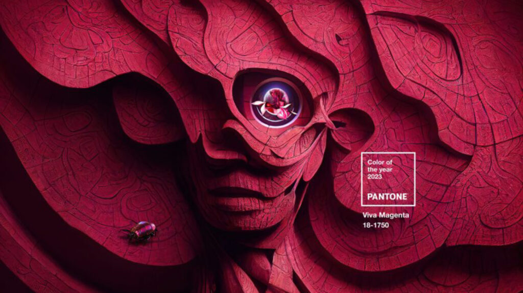 Credit: Pantone
When Pantone announces its annual Colour of the Year, interior designers, writers and brands are quick to discuss it, recommending ways to incorporate the colour into your home over the coming year.
While we understand that colour is a personal choice, sometimes it can be fun to join with the fashion of the year and use it to jazz up your surroundings.
Credit: PantoneIf this year’s Pantone Viva Magenta 18-1750 has inspired you to brighten your home, then we’ve rounded up some of the ways you can incorporate it into your home – without losing your own unique style or needing to drench the walls in pink.
According to the Pantone Colour Institute, this year’s Colour of the Year “vibrates with vim and vigour. It is a shade rooted in nature descending from the red family and expressive of a new signal of strength.
“It is an animated red that revels in pure joy, encouraging experimentation and self-expression without restraint.
“Pantone 18-1750 Viva Magenta welcomes anyone and everyone with the same verve for life and rebellious spirit. It is a colour that is audacious, full of wit and inclusive of all.”
As we continue to move out of the darker times of the pandemic, it seems fitting that some look to embrace a more colourful world.
But with Viva Magenta such a contrast to the ‘greige’ world (a combination of grey and neutral tones that has risen to popularity in interior colour schemes) we have become familiar with over recent years, how can we blend it into our homes without feeling we have entered a pop art-inspired gallery?
According to colour science, the human brain perceives wavelengths of light in different colours. Because there are only 6 colours on the visible spectrum of light – red, orange, yellow, green, blue, indigo, and violet – Magenta is essentially a made up colour created by mixing blue, light blue, violet and red.
It was first seen in the late nineteenth century in colour printing, with the name for the colour coming into use shortly after the (1859) Battle of Magenta, near the Italian town of the same name.
Whilst Viva Magenta may be a strong colour, it can have benefits in the home. In 1979, psychologist Alexander Schauss published research that proved that pink calms the mind and lessens aggression, which is why it was used in US prisons for decades.
It’s also one of the most flattering colours to have in your home, with pink interiors able to improve skin tone, making you and your guests radiate with a subtle glow.
Pink is surprisingly easy to pair with many other colours. Rooted in nature, it works extremely well with green, its colour wheel opposite.
This chinoiserie inspired wallpaper from Sanderson blends the two perfectly and provides a delicate but impactful statement for any room.
 Credit: Sanderson
If it’s just a few splashes of pink you’re looking for, then these jewel coloured vases from Dolly at Not on the High Street would work well and provide a classic pink and green combination when paired with greenery, such as eucalyptus.
 Credit: Not On The Hight Street/Dollys
If you tend to gravitate towards colours that are traditionally considered more masculine, then don’t be put off by the feminine associations of pink.
It also works well with grey and black, providing a balance and element of warmth and sophistication.
This magenta inspired armchair from Marks and Spencer would provide a blast of colour to any living room and would work well a dark and sophisticated scheme.
 Credit: Marks & Spencer
 Credit: Marks & Spencer
Or, if you feel like embracing pink in full, there’s also this stylish sofa from Anthropologie. While it may be more playful in colour, its structured style leaves us in no doubt that it is mature and elegant as a piece.
 Credit: Anthropologie
For something more relaxing, the Marnie Loveseat from Maker & Son in a paler shade of pink is simply made for snuggling.
 Credit: Maker & Son
If a piece of pink furniture is still too much for your taste, then a simple pop of colour from a pink velvet cushion may be all you need. These sumptuous ones from Next demonstrate how pink and teal work so well together, with the pink warming the teal tones of the sofa.
 Credit: Next
For something using a more traditional design that still incorporates the season’s new colour trend, then this sumptuous pink rug from Love Rugs fits the bill. While it may feature a classical design, the vibrant colour brings them up to date and stylish enough to grace any living room.
 Credit: Love Rugs
For a more practical approach, also from Love Rugs, this jute rug with pink border combines both practicality and pink with ease.
 Credit: Love Rugs
For a full top and tail approach to pink, then these lightshades from Graham & Green will brighten your ceiling and also bathe you in a warm glow with their golden inside finish.
Offering a range of sizes to suit floor and table lamps, as well as ceilings, there are plenty of options to viva magenta your lighting.
 Credit: Graham & Green
Whilst installing a pink kitchen may not be on the cards for you, adding pink with accessories such as this magenta mixer from Kitchen Aid can bring colour to your cooking.
 Credit: Kitchen Aid
Glassware and crockery are also an easy update and ones that will bring a feeling of spring into the home.
Sipping your morning coffee from these pink mugs or enjoying your meals on this beautiful crockery set , both from Nordic Nest is an easy way to embrace pink in this environment.
 Credit: Nordic Nest
 Credit: Nordic Nest
Or for more grown-up glamour, this glassware set from Sklum will bring a warm glow to your dinner party and pair perfectly with most colour schemes.
 Credit: Sklum
When it comes to bedrooms, pink is a natural fit. From soothing plaster pinks to brighter shades for impact, there’s a range of pinks to suit all.
This stylish bedroom – featuring two colours from Farrow & Ball – Verdigris Green and Peignoir – demonstrates how it’s also easy to embrace two movements in one go.
 Credit: Farrow & Ball
Painted ceilings are a growing interiors trend, with designers embracing them as the fifth wall.
This soft shade of pink contrasts perfectly with the green ceiling. The added touch of magenta in the form of a cushion demonstrates how the colour works well with so many different combinations, with the rug, ceiling light, wooden bedside tables and black fireplace blending in an eclectic, but complimentary way.
Finally, if pink in public still isn’t your thing, then there’s always the opportunity to add pink to your bathroom scheme for more private pleasure.
These pink honed marble tiles from Mandarin Stone add a subtle touch of pink without overpowering the space.
 Credit: Mandarin Stone
Accessories such as these handwash dispensers from Sklum will also add to the overall look.
 Credit: Sklum
Or, for a full on burst of pink warmth every morning, there’s magenta pink towels from Dunelm to leave you full of energy and vigour to face the day.
 Credit: Dunelm
Written by Sarah Harley she/her
Published: Updated:
Since first picking up a paintbrush and experiencing the joy of re-decorating her bedroom in a questionable red, white and grey scheme as a young teenager, Sarah Harley was hooked on the world of interior design. This obsession even led to a real life ‘Grand Designs’ project in 2005 when she donned a pink hard hat and appeared on TV screens, project managing the renovation and extension of a Grade II listed 17th century Folly in South Wales.
Throughout her career, Sarah has gained an array of experience in several different roles, ranging from copywriting, PR, events management and photography to interior design and home staging. With her two passions being the written word and the joys of a beautifully designed home, Sarah’s mission is to open the door on the world of interiors, inviting readers in to help them work their way through the vast choice of products, ideas and trends so that their own homes can reach their full potential.