
What colours go with cream kitchen units?
These eight kitchens show that cream in your kitchen can be a delicious addition.
Cream kitchen cabinets are all about decadence, sweetness and serenity. In many ways, cream is the ideal neutral, since its gentle hue adds softness to kitchens – rooms that lean towards the décor hardcore, with so many sharp angles and cold appliances.
Unlike stark white, cream won’t give surfaces and accessories that dramatic sharp contrast, but will politely tone down the pointed effect of most hard surfaces without distracting from their beauty.
 Credit: Tom Howley
Cream paints have a lot in common with that whipped cream topping your dessert – the colour comes in various shades of pastel yellow. And there is a surprising amount of variety when it comes to cream paint for kitchen cabinets – Farrow & Ball’s Sand has a uniquely different flavour to Benjamin Moore’s Vanilla Milkshake, for example.
As with all things sweet, balancing cream with the right elements makes sure this delicious neutral does not become overpowering.
Interested in adding the right colour flourishes that pair well with your own off-white kitchen cabinets? Your Exceptional Home Team shares our favourite kitchens, with just the right cream recipe.
 Credit: Martin Moore
Not all cream kitchens whisper. The way to ramp up boldness is to dial down the cream and to add lashings of a punchier colour.
To do this, we recommend navy blue.
This Martin Moore kitchen used cream kitchen units and cabinets as a foundation, but navy blue is brought in to be an equal star player from floor to ceiling. Navy blue has long been a mainstay in kitchen design, matching cream for its timeless and sophisticated appeal.
If you think cream is too sedate, this approach of adding a large helping of navy alongside your cream kitchen units may be a good option. You’ll end up with the best of both worlds – a spirited kitchen tempered by the calming backdrop of a cream neutral base.
2. Pink
Cream looks ideal paired with pink
 Credit: John Lewis of Hungerford
The next best thing to pink kitchen cabinets is pink seating in a sweet kitchen with cream cabinets. Could the effect be any gentler or welcoming? We don’t think so. Could any kitchen be more calming when the heat is on to prepare delicious meals under pressure? We can’t imagine one better for that than this.
The cream and pink colours gel so harmoniously that this room could be mistaken for a space to reflect and unwind in – where a souffle failing to rise is no big deal. Let them eat macaroons instead.
We like it that designers John Lewis of Hungerford curved the banquette seat to further emphasise the welcoming gesture already achieved by the pairing of pink paint with cream kitchen cabinets, and the pink cushions are also a lovely touch.
3. Orange
Cream and orange kitchens are warm and inviting
 Credit: British Standard
What colour is juicier and more delicious than orange? Mix with a helping of cream kitchen cabinets and you have yourself a culinary décor triumph.
And the best part? Your cream and orange kitchen will stand out from the pack as this joyful combo is as rare as it is chic.
Just be sure to choose the right shades for each paint colour. Cream looks great paired with burnt orange because both share a yellowish undertone. These colours on kitchen units create a natural warmth that will be particularly welcome on colder days.
In this kitchen, designed by British Standard, cream and orange are used to cheerful effect in a traditional kitchen. We like the cream pendant lighting that matches the island and emphasises the chosen paint palette.
4. White
Create a perfectly light and bright kitchen with cream and white
 Credit: Tom Howley
What could possibly make cream kitchen units more decadent? Try adding pure white kitchen units to the mix. Think the irresistible appeal of tiered white velvet cake with white frosting and you get the picture.
With white in its immediate vicinity, cream comes into its own as a timeless neutral that gets to take centre stage by virtue of contrast.
Tom Howley, design director at the eponymous kitchen company, explains: “The key with a neutral kitchen is to pair cabinetry with contrasting walls and textural elements. This will give the design an edge and create appealing visual interest. If you have crisp white or cream kitchen cabinetry, you could opt for a contrasting walnut finish for the racks and shelving within. Choose a smoky wood finish for the internal shelving for a stylish edge.
“Our most popular whites are Sorrel, and Orchid – our slightly warm white paint colour, which works wonderfully with a light grey island adding depth to a space.”
Howley adds: “Timeless neutrals are susceptible to change, depending on the light available. We consider where natural light is coming from and how task lighting will create varying shades. Use lighting to your advantage and choose a combination of colours that look fresh in the day but warm and inviting at night.“
5. Black
Toughen up the softness with dark features
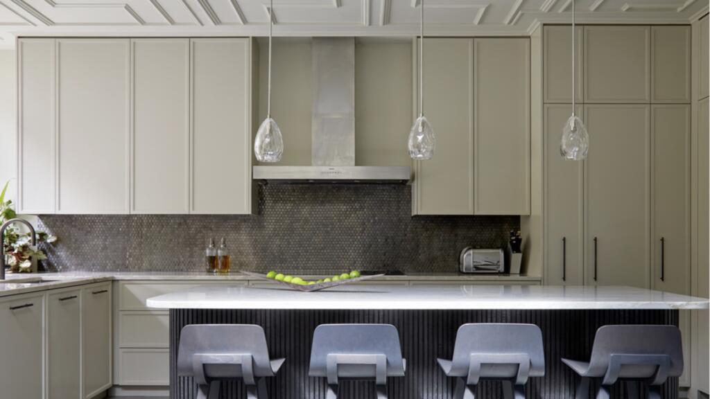 Credit: Hux
What would cheesecake be without that lovely textured base? So it is with textured finishes in a cream kitchen – there is something satisfying about mixing all of that smooth decadence with tougher materials that are a bit rougher to the sight and touch.
Here, master joiners Hux clad an island in ribbed MDF in a dark finish as a way to introduce a texture to this cream kitchen. To ramp up the effect, they also added a highly textured metallic splashback and panelled ceiling, with modern and luxurious results.
Felix Milns founder and managing director at Hux says: “Kitchens can be rather flat spaces as they often feature harder edges and finishes.”
Asked what this dark island added to the kitchen, Milns shares: “The result is an instant feeling of depth and architectural detail – a showstopper moment that will surprise and delight.”
6. Silver
Sharpen up cream cabinets with stainless steel
 Credit: deVOL
Think of silver as a shiny, metallic version of grey and it’s easy to see why this reflective tone pairs so seamlessly with cream kitchen cabinets. Not that is a typical pairing. Gentle as cream is, silver islands and appliances might be seen as too sterile for a compatible pairing. But, in fact, this colour goes will with cream kitchen cabinets, giving them just the right amount of modern edge.
We like that the steel fridge is on display. It makes a change from this appliance being hidden away and it feels unobstructive rather than domineering when paired with traditional crème painted kitchen cabinets. Unlike pairing steel with white, the effect is refined, rather than sharp and clinical.
The cabinets are painted in DeVOL’s proprietary paint colour Mushroom. Discussing the design for the kitchen, DeVOL creative director, Helen Parker, says: “This lofty old schoolhouse in the centre of busy, bustling Brixton is anything but hectic, it is calm in both colour palette and feel. White painted brick walls, the industrial height windows and the original school floorboards, fill this room with simple, original historic beauty.
“One simple run of Shaker cupboards, incorporating a dishwasher, an impressive fridge freezer and double pantry, form the basis of this contemporary but very pretty high-rise kitchen,” adds Parker. “An existing Bulthaup island was kept in place and lends a slightly edgy industrial look, which is perfect for this space that was once the schoolgirls’ dining hall.
“The stainless steel run with sink and hob works with the fridge, knobs, handles and sockets, making it feel far from part of a past kitchen.”
7. Mustard
Cream and yellow are perfect for cheering up a kitchen
 Credit: deVOL
Rich tones of yellow paint make perfect sense with cream kitchen cabinets – after all, cream is really a pastel yellow, so there is no getting this mixture wrong.
In this DeVOL kitchen, cream cabinets make for the perfect neutral backdrop for the punchy yellow of the kitchen island. This heightens the sunny character of the kitchen, which is all about happy, cheerful mealtimes.
Interested in whipping up your own perfect cream kitchen cabinet and yellow kitchen recipe? The team at DeVOL used their proprietary paint colours Mushroom, Linen and Scullery Yellow.
Helen Parker, creative director of DeVOL, says Mushroom is a favourite in her kitchen designs because it works with everything. “The classic combination of Carrara marble and Mushroom paint is always perfect. It’s almost a DeVOL look in itself and has graced literally hundreds of our most coveted rooms.”
She adds: “Linen is a classic creamy cream, but not yellowy; this is the perfect colour for a natural and light-filled kitchen. It is the easiest of colours to work with and goes perfectly with light and dark worktops, brass or silver fittings and traditional or contemporary settings.
“Scullery Yellow is used to brighten up a dark corner of the room and bring a feeling of sunlight to a space. This mustard yellow is wonderful for transforming a room with its warm, cheerful and uplifting tones. Mix with wooden worktops and brass fittings for a gentle, easy and very Shaker look.”
8. Light green
Create a pleasing palette inspired by stone, wood and greenery
 Credit: Martin Moore
Imagine cooking against a kitchen unit colour backdrop reminiscent of walking in a forest on a spring day. As any interior designer will tell you, there is no colour expert more brilliant than Mother Nature.
That’s why cream kitchen units, painted in a stone-inspired hue, will always look perfect when paired with rich timber and a fresh green colour.
In this kitchen by Martin Moore, we like the addition of the dewdrop lighting pendants – the sweet trio embrace and embody the kitchen’s affinity with the peaceful outdoors.
Rich timber is the earthy element that ties the whole kitchen scheme together. Despite the expanse of the heavy timber floors, the cream kitchen cabinets remain the star of the show, and as a result the room feels light, airy and calm.