Stencilling: your new interior hack
Joy Archer
From pink to yellow, this year’s colours bring a feeling of happiness.
As we move into 2023 and we all continue to return to exploring all the world has to offer, interior design trends are reflecting this with the colour predictions for the year ahead.
 Credit: Tiles Direct
As we move into 2023 and we all continue to return to exploring all the world has to offer, interior design trends are reflecting this with the colour predictions for the year ahead.
 Credit: Tiles Direct
From bright pink through to an almost magnolia like shade of pale yellow, the colours of the moment are warmer and more colourful than we’ve seen for some time.
A bold Viva Magenta was revealed by Pantone as this year’s colour of the year, in sharp contrast to last year’s colder Very Peri purple – and brands have responded to this inspiration with some wonderful new shades.
Benjamin Moore was in red alignment with its Raspberry Blush and Farrow and Ball included a rich, earthy red entitled Bamboozle, when it launched eleven new colours at the end of 2022 – the first time the brand has launched new colours since 2018, and an indication of the brand recognising we’re looking for a brighter, more colourful home environment.
As well as one main colour prediction, complementary palettes were announced by each brand. Dulux bucked the red trend when it revealed Wild Wonder, a pale yellow supported by four nature-inspired schemes.
Pantone’s Viva Magenta is the strongest colour on the table this year and we’ve taken a closer look at how you can incorporate pink into your home, but here are some easy-to-follow techniques you can use to bring the natural joy of this year’s colour trends into your home.
Of course, there are many ways to use colour when you’re adding to your home this year – don’t just think you need to paint a wall up to the ceiling and that’s all you can do.
These are our top interior design tips to use 2023’s exciting new colours in wonderful ways, changing the space you inhabit with just a few flicks of the paintbrush or simple accessories.
If you’re looking for a full colour makeover, drench is the technique to employ. It’s exactly as it sounds – using one colour to drench your space. From walls through to ceilings, skirtings and even furniture, drenching with colour is a sure-fire way to create impact.
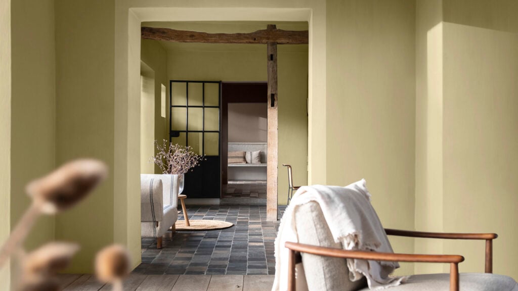
Dulux’s Wild Wonder is perhaps the easiest colour to consider if you are looking for a full ‘drench’ of colour. Used to best effect in rooms with natural sunlight which will ensure the warmth of the shade is fully revealed, it can also work well throughout the home if you are looking to create a natural flow.
 Credit: Dulux
When combined with natural, earthy materials such as slate floor tiles, wooden furniture, textured fabrics and accessories from nature, the colour palette feels both springlike but soothing. Creating a feeling of light and warmth, it is less jarring than perhaps a bright white, but equally not too yellow as to feel childlike.
If it’s a bolder change you’re looking for, then Benjamin’s Moore Raspberry Blush, a vibrant coral pink tinged with red will provide amazing impact when used on walls (rather than the full drench).
 Credit: Benjamin Moore
Softened in this instance with the use of lighter shades on the floor and feature fireplace, the colour adds warmth and depth. But be careful about where you use red…
While it may be the colour associated with love and passion, some experts such as colour psychologist and holistic designer, Suzy Chaizzari suggest red can raise blood pressure and increase heartbeat and muscle movements, making it best used in communal and social areas rather than bedrooms.
If you already love your colour scheme but have a space or feature you’d like to showcase (such as alcoves, shelving or kitchen splashbacks) highlighting them with new colours is a good way of doing so.
A neutral kitchen is given a new lease of life here with the Dulux Lush colour palette, bringing attention to the modern open plan shelving, but without requiring a full kitchen makeover.
 Credit: Dulux
Or for a more vibrant lease of life to your kitchen, why not update your splashback? By only tiling halfway up the wall and pairing with a neutral paint colour, these red brick style tiles from Tiles Direct provide warmth, without overpowering the area.
 Credit: Tiles Direct
For just a highlight of new colour, consider adding some new accessories to your home. It’s an ideal way to embrace a trend without it taking over your home. In keeping with the nature-led approach of the Dulux colour palettes, these cushions and rugs from Weaver Green made entirely from recycled plastic bottles, will bring you up to date without costing the earth.
 Credit: Weaver Green
For admirers of the colour red, in dining rooms, offices and indeed living rooms, red can raise the energy, stimulating conversation, creativity and also appetite. If red is your preferred accent choice, then consider a tableware update.
This stylish crockery from Oka will grace your table without overpowering your guests’ vision, or distract them from your culinary delights. Pairing it with softer shades of grey or stone will further reduce the red effect. Or, for a more contrasting scheme pick a darker navy table linen and ruby red glassware.
 Credit: Oka
When it comes to creating show-stopping aesthetics, the alternative option to drenching a room with colour is to use contrast.
All colours have contrasting options. In design terms, these are the range of colours that appear on the opposite side of the colour wheel. For red, anything in the blue to green range is classed as a contrast. For yellow, it’s pinks and violets.
 Credit: Shutterstock/robin.ph
Whilst the term contrast suggests a clash of colours, art experts at the Tate Modern explain the reason why they are also considered complementary.
In artistic terms, the colour contrast/complement for each primary colour (red, blue and yellow) is obtained by mixing the other two primary colours together. When blue and yellow are mixed they make green, making this the contrast for red. When looking at yellow, blue and red mixed together make violet.
Used by interior designers to create impact, the contrast method is perfect for using on feature walls, to paint ceilings or to paint woodwork in tones that contrast with your main colour.
Wallpaper brand, Graham & Brown uses the technique to full effect in this striking wallpaper jungle -inspired mural. When placed next to furniture using similar tones, it shows how the colours complement each other. The red adds warmth to the green and the green helps to soften the brightness of the red. to soften the brightness of the red.
Softer tones of putty on the woodwork and a grey wooden floor all add to the natural feel of the design, successfully combining all the elements of the natural colour trends for 2023. A design like this would work well in a snug or alcove area of a living room.
 Credit: Graham & Brown
Whilst red and green are an easier combination to contrast because they are naturally found in the living world, violet and yellow may seem a trickier visual aesthetic to achieve.
But, as with all colour trends, there is always a way to incorporate your own personal taste to the aesthetic. The softer yellow of Dulux’s Wild Wonder means it will combine well with a softer shade of violet.
Although an acidic yellow may be too stimulating for sleep, waking up to a softer shade of yellow may make you naturally feel brighter due to its associations with sunshine and happiness. When paired with a softer shade of purple it can create a cheerful bedroom without you needing to reach for sunglasses the moment you wake up.
 Credit: Secret Linen Store
This delicate floral yellow bed linen rom the Secret Linen Store demonstrates well how it contrasts, yet compliments, the soft, matt shade of purple in this bedroom. Depth and texture are added with layers of fabric and the natural materials used on the lightshade nod to the nature theme of this year’s colour trends.
Wood panelling drenched with colour ensures the scheme is clean and simple, thus avoiding sleep distractions.
One of the things we like most about the 2023 colour predictions is that even though colours are bold, they still feel easy to integrate into our homes.
Even if you are firm followers of the grey and neutral colour trends, think for a moment about how happy you feel when you spend time outside. When the light is bright and colours have an extra zing, it’s rare that we don’t feel happier. By adding similar colours to your home interior, you’ll easily create that happy outside feeling.
Simply brightening up your sofa with some pink cushions or switching your breakfast mugs for some bright and cheery yellow ones will naturally bring joy to your day.
Our final tip for starting to add new colour is to use artwork. It’s a great way to test out colours as it’s always easy to take it back down. The nature inspired colours of 2023 also make it simple to find prints that reflect both the colours and elements of the natural world – an easy fit to most interior styles.
Who wouldn’t smile seeing this pink flamingo print from East Urban Home warm their walls?
 Credit: Wayfair/East Urban Home
Or find themselves calmed by the beautiful purple and yellow flowers featured on this photo print from Lupen Grainne Photo at Etsy.
 Credit: Etsy/Lupen Grainne Photo
Written by Sarah Harley she/her
Published: Updated:
Since first picking up a paintbrush and experiencing the joy of re-decorating her bedroom in a questionable red, white and grey scheme as a young teenager, Sarah Harley was hooked on the world of interior design. This obsession even led to a real life ‘Grand Designs’ project in 2005 when she donned a pink hard hat and appeared on TV screens, project managing the renovation and extension of a Grade II listed 17th century Folly in South Wales.
Throughout her career, Sarah has gained an array of experience in several different roles, ranging from copywriting, PR, events management and photography to interior design and home staging. With her two passions being the written word and the joys of a beautifully designed home, Sarah’s mission is to open the door on the world of interiors, inviting readers in to help them work their way through the vast choice of products, ideas and trends so that their own homes can reach their full potential.