Colour
9 top designers lift the lid on their ‘cheat’ paint brands and colours
Joy Archer

Avoid ending up with a paint colour you don’t love.
Ever wondered why your new paint colour still doesn’t look right – even though you used paint tester pots to check you liked it? It could be you’re getting it all wrong.
While the simple act of testing paint doesn’t seem that complicated, there’s more to it than meets the eye. We’re sharing the Exceptional Home team’s top paint tester pot tips to help you get paint sampling right first time. That way, you’ll never make the wrong choice and have to start all over again.
 Credit: Farrow & Ball
Using tech can seem like a fuss-free way to avoid tester pots, but as our look into paint visualiser apps proves, it’s not the perfect substitute for physically applying paint tester pots. In brief, you won’t get as accurate an idea of the colour. Neither will you be able to see how the light affects the colour throughout the day.
That’s why we thoroughly approve of using tester pots. That said, there is an art to it. So, what else do you need to bear in mind in order to avoid costly colour mistakes?
Don’t put different shades of a colour next to one another when testing colours – unless you are planning on using them like this on your walls. How you see each colour will be influenced by the one next to it. If you are only looking for one final colour option, trial it in isolation.
 Credit: Shutterstock/Robert Kneschke
The solo testing also applies to white paint. White comes in a multitude of shades and each one will make you view the other slightly differently, so don’t assume whites can be put next to each other.
 Credit: Coat
While some experts still recommend painting tester pots straight on to the wall, other companies such as Farrow & Ball advise using paper or card. The beauty of this is that you can apply the colour paint you’re testing to larger pieces of paper, which you can temporarily stick to the wall with a low-adhesive tape, and then move them around the room.
Reducing paint marks
Even with the best painting skills and best paintbrush sets, it’s almost impossible to avoid getting paint marks on the wall when testing new colours.
Paint brands such as Lick and Coat recognise problematic paint marks are an issue and offer pre-coloured adhesive squares that you stick to your walls. But it still comes back to size. One small square still means you need a very visual mind to imagine how it will look in a big area.
If you’re using lining paper to test the colour, remember this is a natural shade whereas, your current walls may not be the same, especially if they’re dark. It may also mean you need to paint more coats of your final choice, so don’t underestimate the quantity needed.
When you’re testing a new shade, you need to apply at least two coats, as most paints will require this to achieve their true colour – especially if you are painting over a dark or totally different colour. It’s rare that any paint covers perfectly in one coat, even the ones that say they do.
 Credit: Shutterstock/Triocean
Think about the paint finish you will ultimately be using and make sure you test using the same one. A matt finish, for example, will reflect far less light than a silk or gloss paint, meaning the result can vary wildly.
Make sure you trial the colour on every wall you want to paint and look at it at key points throughout the day and night. It’s important to see how both natural and artificial light change the colour.
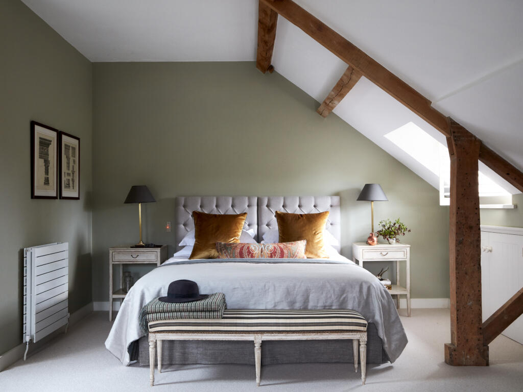
Consider when you will most use the room and make sure you spend time looking at the colour in it during those times. For example, if you’re painting a bedroom, keep in mind that you will spend most time in there at night when there’s mainly artificial light.
It’s this view you will live with so make sure you like how the colour looks during this time and in these lighting conditions.
 Credit: Acupanel
If you’re changing the lights or bulbs when you redecorate, make sure you consider if the light emitted will change from warm to cool. This will again impact how your eyes and brain see the colour.
You’ll likely find that a kitchen has more cool and stimulating bright white lights, whereas a bathroom or bedroom – made for relaxing – tends to feature warmer, yellow-white lighting.
If you’re unsure what to look for when buying light bulbs, check for their temperature rating in kelvin (k): 2,700 to 3,000k is warm, and 4,000 to 5,000k is cool.
If you’re keeping the same furniture and furnishings, make sure you place the paper samples next to each item in turn. Colours change when placed next to other colours.
If you decide you want to use new wallpaper with your paint, don’t forget to put samples of this on your wall next to your paint testing sheets, to test for suitability.
Using wallpaper offcuts
Any offcuts of wallpaper you don’t use or have left over can be placed in frames and used as art. If you’re artistic, you could also use poster boards or canvases to test your colours.
Even if you don’t pick the same colour, there’s a chance they will match your colour palette and with some additional design could be used in your newly painted room.
If you’re trialling similar shades, make sure you write the name and brand on the tester pot so that when it comes to buying a full tin you don’t get it wrong. It’s easy to confuse them when the tonal difference is slight. The printed label placed next to the sample is also not a reliable method of checking it’s the right one as the colour will have changed during the printing process.
 Credit: Shutterstock/Image_hit
Shopping tip
Once you’ve decided on a colour, cut a few small sections out from the lining paper test pieces you’ve painted and take them with you when you go shopping. Having the colour to hand will help when you’re choosing new furniture or accessories.
 Credit: Shutterstock/M.M Photo
Written by Sarah Harley she/her
Published: Updated:
Since first picking up a paintbrush and experiencing the joy of re-decorating her bedroom in a questionable red, white and grey scheme as a young teenager, Sarah Harley was hooked on the world of interior design. This obsession even led to a real life ‘Grand Designs’ project in 2005 when she donned a pink hard hat and appeared on TV screens, project managing the renovation and extension of a Grade II listed 17th century Folly in South Wales.
Throughout her career, Sarah has gained an array of experience in several different roles, ranging from copywriting, PR, events management and photography to interior design and home staging. With her two passions being the written word and the joys of a beautifully designed home, Sarah’s mission is to open the door on the world of interiors, inviting readers in to help them work their way through the vast choice of products, ideas and trends so that their own homes can reach their full potential.